7 Common Color Contrast Mistakes (and How to Fix Them)

Many interfaces fail because of poor color contrast, making text hard to read and critical UI elements easy to miss. This guide breaks down the seven most common contrast mistakes.

color contrast mistakes
Table of Contents

When contrast fails, users struggle to read content, miss critical information, and abandon interfaces entirely. Poor contrast affects everyone, but especially users with low vision, color blindness, or anyone viewing screens in bright sunlight.

The Web Content Accessibility Guidelines (WCAG) set clear standards: normal text requires a 4.5:1 contrast ratio, while large text needs at least 3:1. 

These aren't arbitrary numbers. They represent the minimum threshold for most users to comfortably distinguish text from backgrounds. Meeting these standards improves readability, boosts conversions, and keeps your product legally compliant.

This article will walk through the most common contrast mistakes designers and developers make, and of course  show you how to fix them.

Key Takeaways

  • Low-contrast text is the most common accessibility failure and weakens readability.
  • Never rely on color alone. Use icons, labels, and patterns to reinforce meaning.
  • Testing colors across light, dark, and high-contrast modes prevents hidden accessibility issues.

Why Color Contrast Matters

Color contrast measures the difference in luminance between foreground and background colors. Higher contrast ratios make text and interface elements easier to perceive. 

WebAIM's 2025 accessibility analysis found that 94.8% of home pages had detectable WCAG 2 failures, with low contrast being one of the most common issues..

Text that's hard to read increases cognitive load, slows task completion, and frustrates users. When call-to-action buttons blend into backgrounds, conversion rates drop. When error messages lack contrast, users can't identify or fix problems.

Users with low vision need strong contrast to navigate effectively. Color-blind users miss distinctions between certain color combinations

Also screen glare compounds contrast issues, making marginally readable text completely invisible outdoors or under bright office lighting.

Most Common Color Contrast Mistakes

Using Low-Contrast Text on Backgrounds

Light gray text on white backgrounds remains the most pervasive contrast error. Designers choose subtle grays like #999999 on #FFFFFF, achieving only a 2.8:1 ratio, which is below the 4.5:1 standard. Pastel text on pastel backgrounds creates similar problems.

Thin font weights worsen the issue. Even if color contrast technically passes, lightweight typography reduces perceived contrast. 

For example, testing #999999 text on #FFFFFF in our contrast checker shows a failing 2.85 ratio.

poor color contrast

Switching to #595959 immediately passes at 7:00.

excellent color contrast

The fix is straightforward: darken text or lighten backgrounds until you hit minimum ratios. For body text, aim for #595959 or darker on white. Test systematically rather than eyeballing it.

Generate Box Shadows

Create beautiful CSS shadows in seconds with our visual editor.

Try Generator

Relying on Color Alone to Convey Information

Status indicators that depend solely on red for errors and green for success exclude color-blind users. Bar charts using only color to distinguish categories become meaningless when users can't differentiate hues.

This mistake violates WCAG success criterion 1.4.1. Information must be perceivable through multiple channels.

Add redundant cues: icons accompanying status messages, patterns or textures in charts, text labels on graphs, shape variations for different categories. 

When you indicate an error, combine red coloring with an X icon and descriptive text. This benefits everyone, not just users with color vision deficiencies.

Overusing Transparent or "Faded" Elements

Designers love minimalism, but transparency often sacrifices usability. Buttons with 40% opacity look sleek but become unreadable. Ghost buttons frequently fail contrast requirements on both the outline and text.

Placeholder text presents a special problem. Many browsers render it at low opacity by default. Users mistake faint placeholder text for already-filled content or miss it entirely.

Set minimum opacity levels. Button backgrounds should sit at 100% opacity. If you want lighter buttons, use lighter solid colors that still meet contrast ratios rather than transparency. Style placeholder text explicitly to ensure adequate contrast—aim for at least 4.5:1 like any other text.

Poor Contrast in Hover, Active, or Disabled States

Interactive states need contrast too. Hover effects that lighten text can push it below acceptable ratios

Visited links that change from blue to purple might blend into certain backgrounds. Disabled buttons styled with excessive fading become invisible.

Users need to identify interactive elements in all states. A button that passes contrast when idle but fails on hover creates confusion.

Test every interactive state. Maintain minimum contrast ratios across default, hover, focus, active, and disabled appearances. 

Use our contrast checker to test your hover color before implementing it. Enter your base and hover colors side-by-side to ensure both states pass.

Using Background Images Behind Text

Placing text directly over photographs creates unpredictable contrast. Even carefully chosen images have areas where text disappears. Visual noise from textures, patterns, and varying brightness makes reading difficult regardless of technical contrast ratios.

Apply solid or gradient overlays between images and text. Dark semi-transparent overlays (like black at 60% opacity) ensure white text remains readable across the entire image. Alternatively, confine text to solid color sections of your layout.

Calculate contrast against the darkest (for light text) or lightest (for dark text) area of the image after overlay application. If an image has bright spots that reduce contrast below standards, adjust your overlay or reposition content.

Not Testing Dark Mode Variants

Colors that work beautifully in light mode often fail in dark mode. Pure black backgrounds create excessive contrast with white text, causing eye strain. 

Auto-generated dark modes on some operating systems invert colors unpredictably, breaking carefully planned palettes.

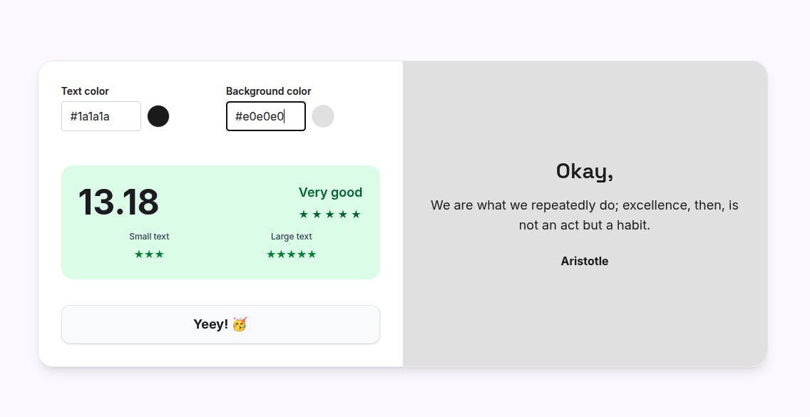
Dark mode isn't simply inverted light mode. It requires intentional color selection. Use dark grays (like #1a1a1a) rather than pure black. Reduce white text to off-white (#e0e0e0) to lower intensity.

excellent color contrast

Establish separate color tokens for light and dark themes. Review both modes during design and development. Check that interactive elements, borders, and subtle UI components maintain adequate contrast in both contexts.

Ignoring Contrast in Icons and UI Elements

Non-text interface elements need 3:1 contrast against adjacent colors. Form field borders, icon outlines, and dividing lines frequently slip below this threshold. Designers choose subtle grays for visual hierarchy without realizing they've created accessibility barriers.

Icons with thin strokes become nearly invisible at low contrast. Input field borders that blend into backgrounds make forms difficult to complete. Inactive but visible UI elements need sufficient contrast so users can perceive them, even if they can't interact.

Audit all UI components, not just text. Form inputs, buttons, icons, focus indicators, and dividers all require attention. Use stroke weights of at least 2px for icons and ensure borders meet the 3:1 minimum.

How to Prevent Color Contrast Issues

Use a Contrast Checker Tool

Contrast checkers remove guesswork. Our contrast checker handles basic text-on-background scenarios. Contrast Grid tests multiple color combinations simultaneously. 

Check text size and weight alongside color. Large text (18pt+ regular or 14pt+ bold) requires only 3:1, while smaller text needs 4.5:1. Verify contrast against actual backgrounds, including hover states and variations.

Follow WCAG 2.1 Contrast Guidelines

Normal text demands 4.5:1 minimum contrast. Large text needs 3:1. UI components and graphical objects require 3:1 against adjacent colors. These are minimums and exceeding them improves usability.

WCAG Level AAA sets higher standards (7:1 for normal text, 4.5:1 for large text). While not required, AAA compliance benefits users significantly. Aim for it when possible, especially for body text and primary actions.

Test Across Light, Dark, and High-Contrast Modes

Review designs in every display mode users might encounter. Light mode remains most common but dark mode adoption continues growing. High-contrast modes, available in Windows and other operating systems, strip away subtle styling and expose contrast failures.

Build testing into your workflow. Before finalizing any design, toggle through display modes. Enable operating system accessibility features and verify your interface remains functional. This takes minutes but prevents hours of remediation later.

Use Semantic Cues, Not Just Color

Layer multiple signifiers for every piece of information. Combine color with icons, text labels, patterns, position, or shape. 

Error messages should include red coloring, an alert icon, and descriptive text. Graph data should vary by pattern or shape, not just hue.

This redundancy strengthens communication for all users. Someone might miss color, miss an icon, or skim text, but multiple cues ensure the message reaches them.

Build a Reusable, Accessible Color System

Create a color palette with tested, approved combinations before building interfaces. Define color tokens (like "primary-900," "primary-100") with guaranteed contrast ratios. Document which pairings work for text, which suit backgrounds, and which pass at different WCAG levels.

This systematic approach ensures consistency. Designers pick from pre-approved colors knowing they'll meet standards. Developers reference tokens rather than arbitrary hex codes. When you scale, you maintain quality without re-testing everything.

Convert PX to REM

Build responsive layouts with our instant unit converter for pixels and rem units.

Convert Now

Checklist for Designers and Developers

  • All text meets minimum contrast ratios (4.5:1 for normal, 3:1 for large)
  • Icons, borders, and UI components achieve 3:1 contrast
  • Interactive states (hover, focus, active, disabled) maintain adequate contrast
  • Tested on mobile and desktop devices
  • Verified in both light and dark modes
  • Avoided relying solely on color to convey information
  • Checked contrast with actual backgrounds, including images and gradients
  • Used contrast checker tools during design and development
  • Placeholder text remains readable
  • Focus indicators are clearly visible

FAQs

What is acceptable color contrast?

Normal text requires 4.5:1 contrast minimum. Large text (18pt+ or 14pt+ bold) needs 3:1. UI components need 3:1 against adjacent colors.

Do large fonts require the same contrast ratio?

No. Large text (18pt regular or 14pt bold and above) requires only 3:1 contrast instead of 4.5:1 because size improves readability.

Are brand colors allowed to be adjusted?

Yes. Accessibility requirements override brand guidelines. Adjust colors as needed or use them only where sufficient contrast exists naturally.

How do I check contrast for gradient backgrounds?

Test against the lightest point of the gradient for dark text, or the darkest point for light text.

What about contrast for images?

Images themselves don't require specific contrast, but text over images must meet standards. Use overlays or solid backgrounds to ensure readability.

Conclusion

Color contrast mistakes are common but entirely preventable. Testing with the right tools, following WCAG guidelines, and building accessible color systems from the start saves time and improves outcomes. 

When you prioritize contrast consistently, you create products that work for everyone, in every condition. Make it standard practice, not an afterthought.