Drop shadow excels with transparent images such as PNGs and WebP files. Product photos with transparent backgrounds, logos, icons, and illustrations all benefit from shape-aware shadows.
SVG icons gain particular advantage. A heart icon, star rating, or menu hamburger receives shadows that match their actual shapes rather than rectangular containers. This creates more polished, professional appearances.
Decorative UI elements with irregular shapes like badges, look significantly better with drop-shadow(). The shadow reinforces the element's actual form.
Shape awareness creates realistic depth. When shadows follow visible contours, they feel natural and intentional. Users perceive better visual relationships between elements and backgrounds.
Floating action buttons with icon-only content, standalone SVG illustrations, and decorative graphical elements all look more sophisticated with properly shaped shadows.
Animation compatibility works well since filter properties animate smoothly with CSS transitions and keyframes. Animated shadow growth or color shifts run efficiently.
Drop shadow lacks the spread property, limiting control compared to box-shadow. You can't expand or contract shadows independently from blur, reducing flexibility for specific design requirements.
Performance impact increases with complexity. Applying drop-shadow() to large, intricate images or multiple elements simultaneously can cause rendering lag on lower-powered devices.
The browser must calculate shadows based on alpha channel data, which demands more processing than simple rectangular shadows.
Large components with many child elements perform poorly with drop-shadow() because the filter applies to the entire rendered output. Box shadow remains superior for complex containers.
Rendering Method: Box shadow uses rectangular boundaries while drop shadow follows alpha channels and visible shapes.
Performance: Box shadow performs excellently across devices and complexity levels. Drop shadow performs well for simple elements but struggles with complex rendering.
Customization Control: Box shadow offers spread, blur, offset, and multiple layers. Drop shadow provides blur and offset only.
Shape Handling: Box shadow creates rectangular shadows regardless of content shape. Drop shadow respects transparency and follows visible contours.
Best Use Cases: Box shadow suits containers, cards, buttons, and standard UI components. Drop shadow works best for icons, transparent images, and irregular shapes.
Browser Support: Both enjoy excellent modern browser support. Box shadow has slightly better legacy support but the difference rarely matters today.
Applying box-shadow to transparent PNG icons or SVG graphics creates rectangular halos around circular or irregular shapes. The shadow reveals the element's bounding box rather than following the visible design.
This mistake appears constantly in icon sets when designers apply familiar box-shadow syntax without considering shape context. The result looks unpolished and amateur.
Fix: Use filter: drop-shadow() for any element with transparency or irregular visible shapes. The shadow will follow actual contours, creating cohesive depth.
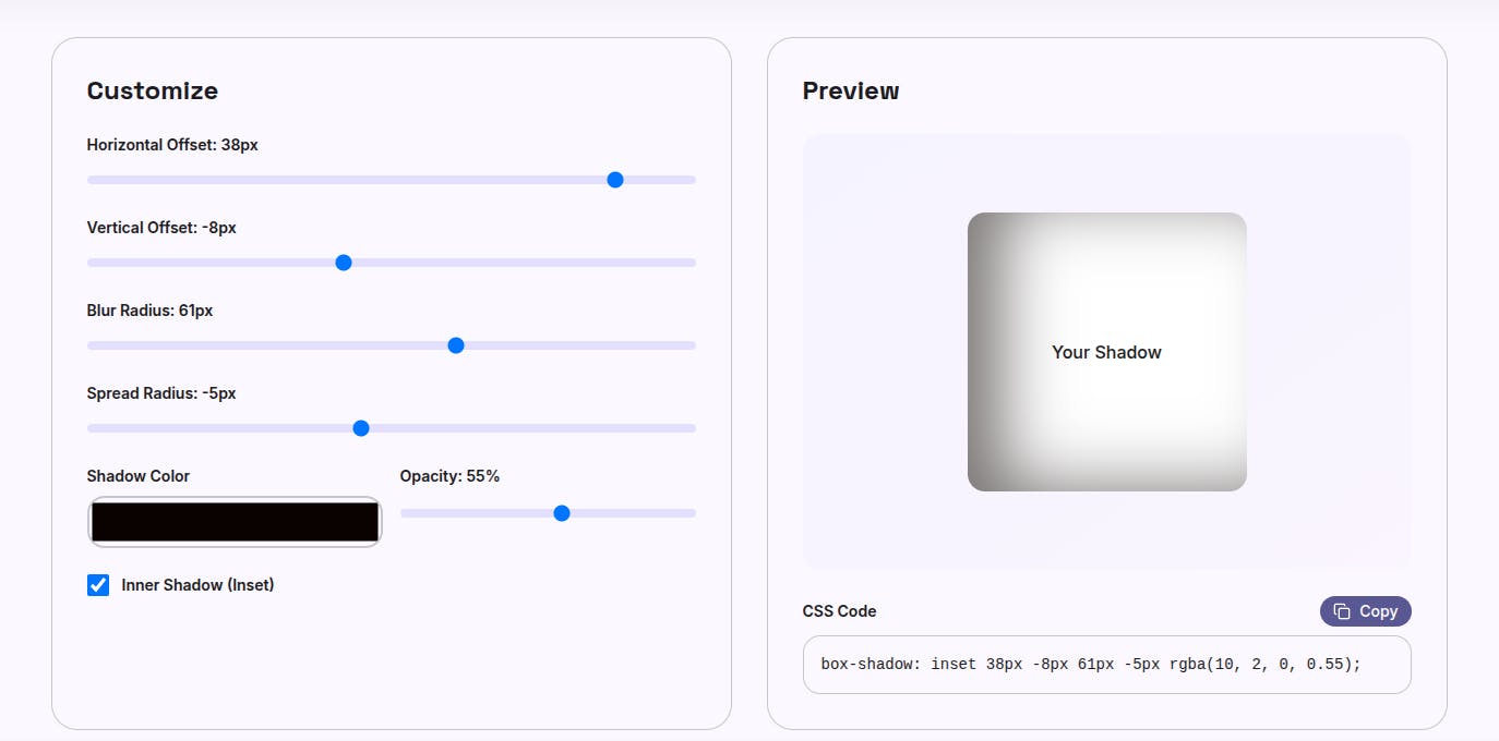
Excessive blur radius on drop-shadow() creates fuzzy, low-contrast shadows that make elements appear unfocused. Designers and developers sometimes compensate for lack of spread control by increasing blur, which reduces shadow definition.
Fix: Use moderate blur values (4-8px for most cases) and adjust shadow opacity instead. Layer multiple drop-shadow() calls if you need more complex depth:
filter:
  drop-shadow(0 2px 4px rgba(0, 0, 0, 0.1))
  drop-shadow(0 4px 8px rgba(0, 0, 0, 0.08));
Stacking numerous shadows across many elements creates performance bottlenecks. Animations suffer, scrolling becomes janky, and lower-powered devices struggle.
Fix: Limit shadows to elements that need depth emphasis. Use flat design for secondary elements. Restrict animated shadows to primary interactive components. Test on mid-range devices to verify acceptable performance.