Color Theory for Beginners: A Complete Guide to Understanding Colors

Color theory provides a structured approach to combining colors effectively, helping you make intentional design choices rather than guessing.

color theory

Understanding color theory is essential for artists and web designers who want to create visually compelling work.

Color theory provides a structured approach to combining colors effectively, helping you make intentional design choices rather than guessing.

Whether you're painting, designing websites, or decorating a room, mastering these fundamental principles will elevate your creative projects.

This guide breaks down color theory into digestible concepts that anyone can apply immediately to their work.

The Color Wheel

The color wheel is the foundation of color theory, serving as a visual representation of how colors relate to one another.

Developed by Sir Isaac Newton in 1666, this circular diagram organizes colors in a logical sequence that reveals their relationships.

color wheel

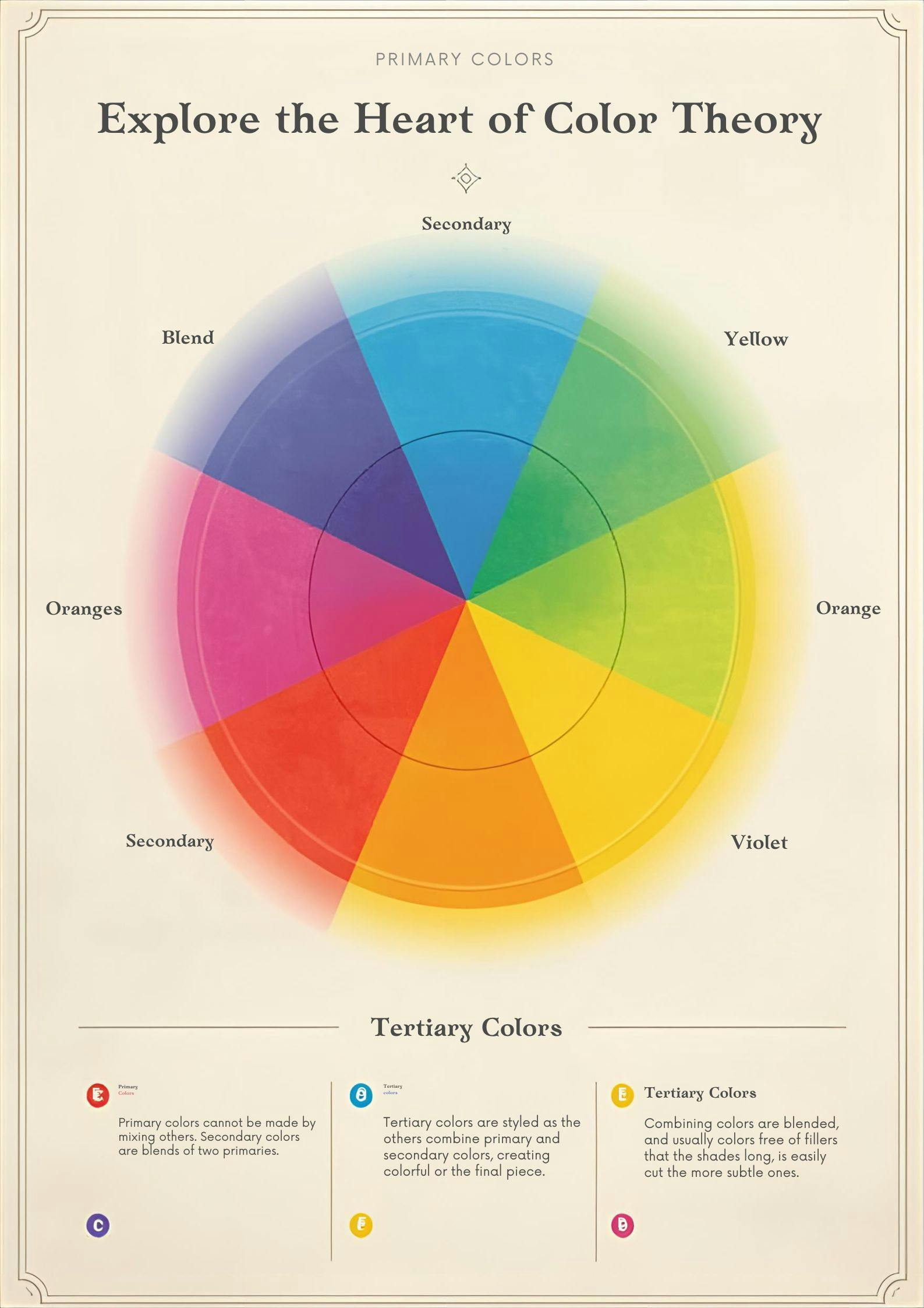
The traditional color wheel contains 12 colors derived from three primary colors, which mix to create secondary colors and tertiary colors.

Understanding the color wheel helps you predict how colors will interact and guides you in creating harmonious color combinations for any project.

Primary and Secondary Colors

Primary colors form the building blocks of all other colors on the wheel. These colors—red, blue, and yellow—cannot be created by mixing other colors together.

They exist independently and serve as the starting point for color mixing. When you combine two primary colors in equal proportions, you create secondary colors.

Mixing red and yellow produces orange, blue and yellow create green, and red and blue make purple.

These six colors (three primary and three secondary) establish the basic structure of the color wheel and provide endless possibilities for color combinations.

Tertiary Colors

Tertiary colors expand your palette by filling the gaps between primary and secondary colors.

These colors are created by mixing a primary color with an adjacent secondary color on the color wheel.

The six tertiary colors are:

  • Red-orange
  • Yellow-orange
  • Yellow-green
  • Blue-green
  • Blue-purple
  • Red-purple

Understanding tertiary colors gives you a more nuanced color palette to work with, allowing for subtle variations and sophisticated color schemes.

These intermediate hues provide the variety needed to create depth and interest in your designs while maintaining color harmony.

Color Schemes

Color schemes are predetermined formulas for selecting colors that work well together. These systematic approaches take the guesswork out of choosing colors and ensure your palette creates visual harmony.

By following established color schemes based on the color wheel, you can create professional-looking designs even as a beginner.

Different color schemes evoke different moods and serve different purposes, so understanding each type helps you make strategic color choices for your specific project needs.

Complementary Color Scheme

A complementary color scheme uses colors that sit directly opposite each other on the color wheel.

Examples include red and green, blue and orange, or yellow and purple.

This scheme creates maximum contrast and visual interest because complementary colors intensify each other when placed side by side.

The high contrast makes this scheme ideal for making elements stand out or creating dynamic, energetic designs.

However, use complementary colors carefully—too much contrast can be overwhelming, so consider using one color as dominant and the other as an accent.

Analogous Color Scheme

Analogous color schemes feature colors that are next to each other on the color wheel, such as blue, blue-green, and green.

analogous

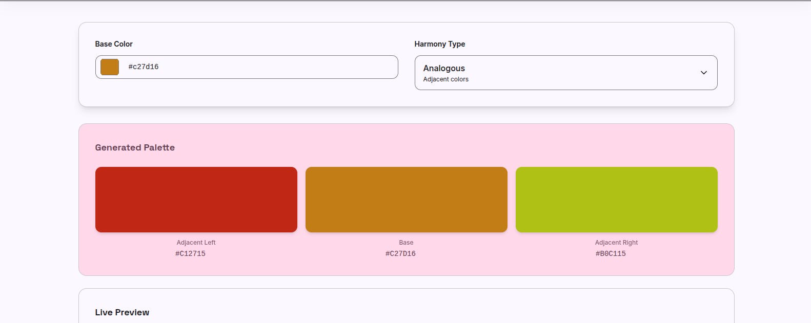
This approach creates serene, harmonious designs because the colors share common undertones.

Analogous schemes occur frequently in nature—think of a sunset with its reds, oranges, and yellows—making them inherently pleasing to the eye.

When using analogous colors, choose one dominant color, a second to support it, and a third as an accent to create visual hierarchy and prevent monotony.

Triadic Color Scheme

A triadic color scheme employs three colors that are evenly spaced around the color wheel, forming a triangle.

Examples include red, yellow, and blue (the primary colors) or orange, green, and purple (the secondary colors).

triadic

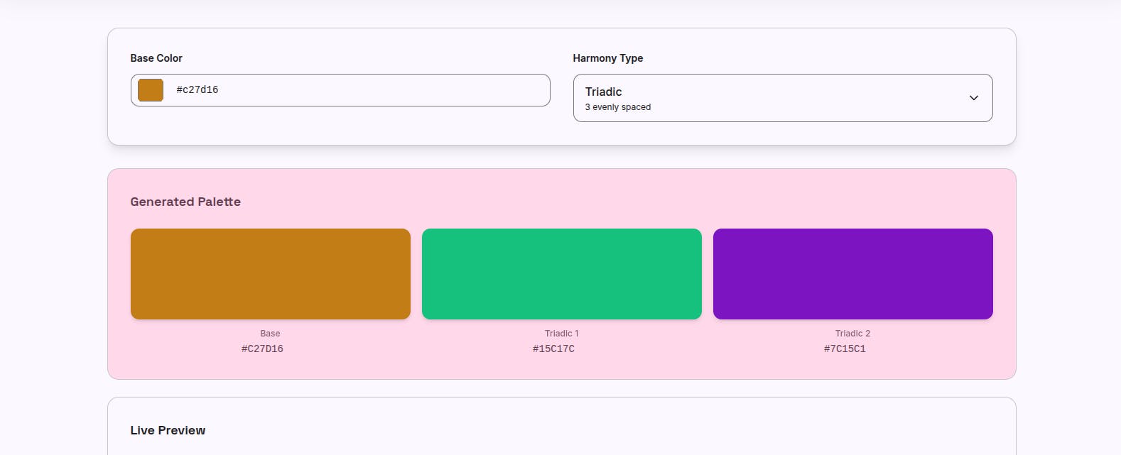
This scheme offers strong visual contrast while maintaining color balance, creating vibrant yet harmonious designs.

Triadic schemes work best when you let one color dominate and use the other two as accents, preventing the palette from becoming too chaotic or competitive.

Generate Color Palettes

Discover perfect color combinations with our color harmony generator

Find Colors

Color Harmonies

Color harmonies are combinations of colors that create a sense of balance and visual order.

These harmonious relationships occur when colors share specific mathematical relationships on the color wheel.

Beyond the three main color schemes, harmonies can include split-complementary (a base color with the two colors adjacent to its complement) or tetradic (four colors forming a rectangle on the wheel).

Achieving color harmony doesn't mean your palette must be boring or safe—it means your colors work together purposefully rather than clashing or creating visual confusion.

Color Temperature

Color temperature refers to the warmth or coolness that colors convey, influencing the psychological and emotional impact of your designs.

This concept divides the color wheel roughly in half, with warm colors on one side and cool colors on the other.

Understanding color temperature helps you control the mood and atmosphere of your work.

Warm colors appear to advance toward the viewer, while cool colors recede, creating spatial depth in your compositions.

monochromatic

Warm Colors

Warm colors include red, orange, yellow, and variations of these hues.

These colors are associated with energy, passion, warmth, and excitement because they remind us of fire, sunshine, and heat.

Warm colors grab attention and stimulate emotions, making them excellent choices for calls-to-action or elements you want to emphasize.

However, overusing warm colors can create overwhelming or aggressive designs, so balance them with neutral or cool colors for visual relief.

Cool Colors

Cool colors encompass blue, green, purple, and their variations.

These colors evoke calmness, serenity, professionalism, and tranquility, resembling water, sky, and nature.

Cool colors have a calming effect on viewers and work well for backgrounds or when you want to create a peaceful, trustworthy atmosphere.

They're particularly effective in spaces meant for relaxation or concentration. Cool colors tend to recede visually, making spaces feel larger and more open.

Saturation and Tint

Saturation refers to the intensity or purity of a color—how vivid or muted it appears.

Highly saturated colors are bold and pure, while desaturated colors appear grayed out or muted.

You can adjust saturation by adding gray to a color, creating more subtle variations.

A tint is created by mixing a color with white, producing lighter versions of the original hue.

Tints maintain the color's character while reducing its intensity, perfect for creating softer, more delicate designs or establishing visual hierarchy through lightness variations.

Color Mixing

Color mixing is the practical application of color theory, allowing you to create any color imaginable from a limited palette.

Additive color mixing (used in light, such as digital screens) combines red, green, and blue light to create colors.

Subtractive color mixing (used in pigments and paints) starts with white and adds colors to absorb light, using cyan, magenta, and yellow as primaries.

Understanding the difference between these systems prevents confusion when moving between digital and physical mediums.

Choosing the Right Colors

Making color choices involves considering your project's purpose, target audience, and emotional message.

  1. Start by identifying the mood you want to create, then select a dominant color that supports this goal.
  2. Build your color palette by adding complementary, analogous, or triadic colors based on your desired level of contrast. Limit your palette to 3-5 colors to maintain cohesion, and use the 60-30-10 rule: 60% dominant color, 30% secondary color, and 10% accent color. 
  3. Test your palette in context before finalizing to ensure it achieves your intended effect.

Practical Applications of Color Theory

Color theory applies to countless real-world scenarios beyond traditional art.

Web designers use color schemes to create intuitive interfaces and guide user attention. Interior designers apply color temperature to make spaces feel larger or cozier.

Marketers choose colors strategically to evoke specific emotions and drive consumer behavior.

Fashion designers create coordinated outfits using harmonious color combinations.

Even everyday decisions—like choosing paint colors or arranging flowers—benefit from understanding how colors interact and influence perception.

Conclusion

Mastering color theory fundamentals empowers you to make confident, intentional color decisions in any creative endeavor.

The color wheel, color schemes, and principles of harmony provide reliable frameworks for combining colors effectively.

Remember that rules exist to guide you, not restrict you—experiment with different combinations to develop your personal style and discover what resonates with your audience.

FAQ

What is color theory?

Color theory is a framework used to understand how colors interact and how they can be combined effectively. It provides principles for creating harmonious color combinations based on the relationships between colors on the color wheel.

What are the primary colors?

The primary colors are red, blue, and yellow, which cannot be created by mixing other colors. These three colors serve as the foundation for creating all other colors through mixing.

How do I create a color palette?

A color palette can be created by selecting a dominant color and choosing complementary, analogous, or triadic colors. Use the 60-30-10 rule for balance and limit your palette to 3-5 colors for cohesion.

What is the difference between warm and cool colors?

Warm colors are associated with energy and warmth, including reds, oranges, and yellows. Cool colors are calming and serene, including blues, greens, and purples. They create different psychological effects in designs.

How can I learn more about color theory?

There are numerous resources, including books, online courses, and tutorials, to further your understanding of color theory. Practice by analyzing color use in designs you admire and experimenting with different color combinations in your own work.

Generate Color Palettes

Discover perfect color combinations with our color harmony generator

Find Colors