WCAG Contrast Guidelines: Ensuring Web Accessibility

This article provides an overview of the WCAG contrast guidelines, emphasizing the importance of sufficient contrast for web accessibility.

WCAG Contrast Guidelines

This article provides an overview of the WCAG contrast guidelines, emphasizing the importance of sufficient contrast for web accessibility. Understanding and implementing proper color contrast is fundamental to creating inclusive digital experiences that serve all users effectively.

Whether you're a web designer, developer, or content creator, mastering WCAG contrast requirements ensures your website meets accessibility standards and provides equal access to information for everyone, including individuals with visual impairments or color vision deficiencies.

Understanding WCAG Contrast Guidelines

What are WCAG?

The Web Content Accessibility Guidelines (WCAG) are designed to ensure that web content is accessible to all users, including those with disabilities.

Developed by the World Wide Web Consortium (W3C), WCAG provides a comprehensive framework for making web content perceivable, operable, understandable, and robust.

These guidelines serve as the international standard for web accessibility, helping organizations comply with legal requirements while creating better user experiences.

WCAG covers various aspects of accessibility, with color contrast being one of the most critical components for visual accessibility.

Importance of Color Contrast

Color contrast is crucial for readability and accessibility, particularly for users with visual impairments.

Insufficient contrast between text and background colors creates significant barriers for users with low vision, color blindness, or age-related vision changes.

When text color and background color lack adequate contrast, content becomes difficult or impossible to read, effectively excluding millions of potential users from accessing your information.

Beyond accessibility concerns, good color contrast improves readability for all users, especially in challenging viewing conditions like bright sunlight or low-light environments.

Prioritizing color contrast demonstrates commitment to inclusive design and ensures your message reaches the widest possible audience.

WCAG Contrast guidelines

Contrast Ratio Requirements

What is Contrast Ratio?

The contrast ratio is a measure of the difference in luminance between two colors, typically text and background color.

This numerical value ranges from 1:1 (no contrast, such as white text on white background) to 21:1 (maximum contrast, such as black text on white background).

The contrast ratio calculation considers the relative luminance of both the foreground and background colors, providing an objective measurement of how distinguishable text appears against its background.

Understanding contrast ratio helps designers and developers make informed decisions about color combinations that ensure accessibility compliance.

WCAG Success Criteria

To meet WCAG success criteria, text must have a contrast ratio of at least 4.5:1 for normal text and 3:1 for large text.

Normal text is defined as text smaller than 18 points (or 14 points if bold), while large text is 18 points or larger (or 14 points bold or larger).

These minimum thresholds represent Level AA compliance, which is the standard most organizations aim to achieve.

WCAG Level AAA, the highest level of accessibility, requires a contrast ratio of 7:1 for normal text and 4.5:1 for large text.

Meeting these success criteria ensures that text remains readable for users with moderately low vision, estimated to affect approximately one in twenty people.

Evaluating Color Combinations

Using a Color Contrast Checker

A color contrast checker can help evaluate color combinations to ensure they meet the required contrast ratio standards.

These tools allow you to input your foreground text color and background color, then instantly calculate whether the combination passes WCAG requirements.

contrast checker

Many color contrast checkers provide real-time feedback, showing whether your colors meet Level AA or AAA standards for both normal and large text.

Some advanced checkers also suggest alternative colors that would pass accessibility requirements while maintaining your design aesthetic.

Regularly using a contrast checker during the design process prevents accessibility failures and saves time by catching issues before implementation.

Testing Text and Images of Text

When evaluating contrast, both text and images of text must be considered to ensure they meet the contrast requirements.

Images of text—such as logos, headlines rendered as graphics, or text embedded in photographs—are subject to the same contrast ratio requirements as regular text.

This requirement ensures that all textual information remains accessible regardless of its presentation format.

However, decorative text or text that is part of a logo or brand name may be exempt from contrast requirements.

When testing, evaluate the contrast ratio between the text within the image and its immediate background, not the page background.

This distinction is important for accurately assessing whether images of text meet accessibility standards.

Check Contrast Checker

Ensure your designs meet WCAG accessibility standards with our free contrast checker.

Check Contrast

Techniques for Improving Contrast

Background and Text Color Specifications

Ensure that the background color is specified when the text color is specified to avoid failures in contrast evaluation.

A common accessibility failure occurs when developers specify only the text color in CSS while leaving the background color undefined or set to "transparent."

This approach creates unpredictable contrast ratios because users may have custom browser settings or operating system themes that change default background colors.

Content fails if no background color is specified when the text color is specified, or vice versa.

Always declare both values explicitly in your stylesheets to guarantee consistent contrast ratios across different viewing environments and user preferences.

Using Borders to Add Contrast

Borders can add contrast and would enhance the visibility of text against the background.

When you need to place text on images or complex backgrounds where achieving sufficient contrast proves difficult, adding borders or outlines to text can provide the additional contrast needed to meet WCAG requirements.

Text shadows, when implemented with sufficient offset and blur, can also improve readability by creating a subtle contrast buffer between text and background.

Another effective technique involves placing text within semi-transparent overlays or containers with solid background colors, ensuring the contrast ratio between text and its immediate background meets accessibility standards regardless of what appears behind the container.

Common Issues with Contrast

WCAG contrast guidelines

Low Contrast Levels

Content with low contrast can lead to accessibility failures, especially at lower contrast levels.

Many designers inadvertently create low contrast by using light gray text on white backgrounds or subtle color variations that appear distinguishable to them but fail accessibility testing.

Light text on light backgrounds or dark text on dark backgrounds frequently falls below the minimum 4.5:1 threshold.

Low contrast particularly affects users with color blindness, who may perceive even less contrast than the measured ratio indicates.

Aging populations face increased difficulty reading content at lower contrast levels due to natural changes in vision, making adequate contrast ratio essential for serving diverse audiences.

Failure to Meet Contrast Requirements

Content fails if no background color is specified when the text color is specified, or vice versa.

This failure mode occurs more frequently than many developers realize, particularly in CSS implementations that modify only foreground or background properties without explicitly setting both.

When websites rely on default browser colors for either text or background, they cannot guarantee that the resulting contrast ratio meets WCAG success criteria across different user environments.

Additionally, text overlaid on images or gradients often fails contrast requirements because the background color varies throughout the image.

These failures create significant accessibility barriers and may expose organizations to legal liability under accessibility regulations like the Americans with Disabilities Act or Section 508.

Conclusion

Ensuring that a contrast ratio meets WCAG guidelines is essential for providing accessible web content.

By implementing proper color contrast throughout your website, you create an inclusive digital environment that serves all users effectively, regardless of their visual abilities.

The contrast requirements outlined in WCAG represent minimum standards, not maximum efforts—striving for higher contrast ratios where possible benefits everyone.

Regular testing with a color contrast checker, thoughtful color selection, and explicit background color and text color specifications will help you avoid common accessibility failures and create truly accessible web experiences.

FAQ

What is the minimum contrast ratio required by WCAG?

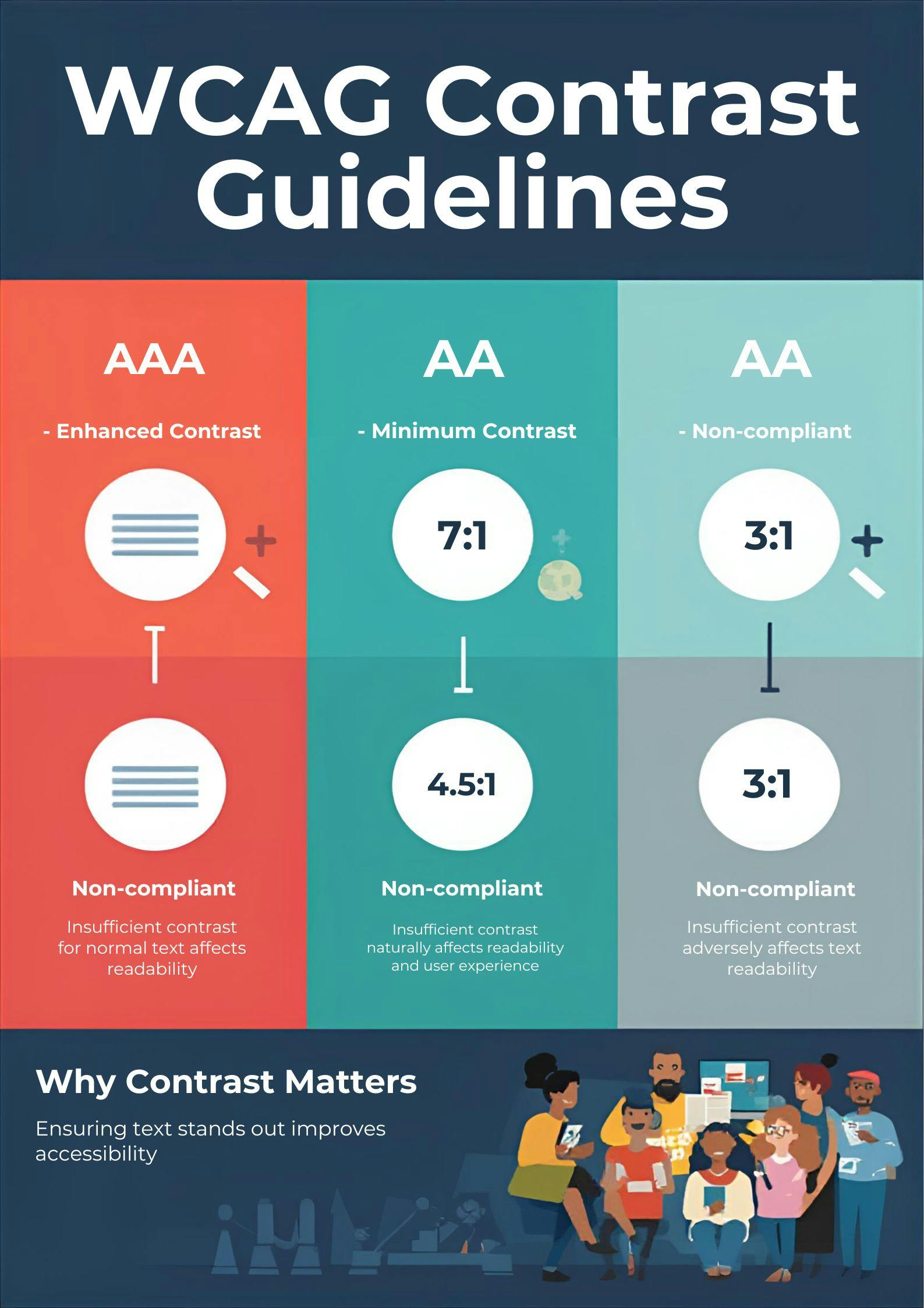
The minimum contrast ratio required by WCAG is 4.5:1 for normal text and 3:1 for large text to meet Level AA standards. Level AAA requires 7:1 for normal text and 4.5:1 for large text.

How can I check color contrast on my website?

You can use a color contrast checker tool to evaluate the contrast ratio of text against its background color. Popular tools include WebAIM's Contrast Checker, Color Contrast Analyzer, and browser extensions that test contrast directly on live websites.

What happens if my website fails the contrast requirement?

If your website fails to meet the contrast requirement, it may not be accessible to users with visual impairments, leading to a poor user experience. This can result in legal liability, reduced audience reach, and exclusion of users with disabilities.

Can I use images of text instead of actual text?

While you can use images of text, they must also meet the same contrast guidelines to ensure accessibility. Whenever possible, use actual text with CSS styling instead of images of text, as real text provides better accessibility and flexibility.

Check Color Contrast

Ensure your designs meet WCAG accessibility standards with our free contrast checker.

Check Contrast