5 CSS Gradient Mistakes That Make Your Design Look Amateur

Gradients add depth and visual interest to modern interfaces. They create focal points, establish brand identity, and make flat designs feel dimensional.

CSS Gradient Mistakes
Table of Contents

Gradients add depth and visual interest to modern interfaces. They create focal points, establish brand identity, and make flat designs feel dimensional. But one poorly executed gradient can undermine an entire layout.

The difference between professional and amateur gradient usage often comes down to subtle choices like color harmony and contrast management. Small mistakes compound quickly, turning sleek interfaces into chaotic eyesores that distract users and hurt credibility.

This article will walk through the five most common CSS gradient mistakes and show you exactly how to fix them.

Key Takeaways

  • Avoid harsh color jumps
  • Limit color stops
  • Maintain text contrast
  • Choose intentional angles
  • Use gradients sparingly

Using Harsh, High-Contrast Color Transitions

What This Mistake Looks Like

Sharp jumps between colors create jarring visual experiences. Think neon pink transitioning directly into electric blue, or bright yellow slamming into deep purple. 

These abrupt shifts lack the smooth blending that makes gradients feel intentional. Overly saturated color combinations assault the eye, creating a visual intensity that overwhelms rather than enhances.

Why It Looks Unpolished

Harsh gradients evoke outdated web aesthetics, the kind you'd find on sites from the late 1990s. Poor color flow disrupts visual consistency, making your interface feel uncoordinated.

Natural gradients blend seamlessly; amateur ones announce themselves loudly. When colors clash rather than harmonize, users focus on the gradient instead of your content.

How to Fix It

Choose colors with similar hue angles or brightness levels. Blue-to-purple works because both sit close on the color wheel. Adjust saturation downward since muted tones blend more gracefully than neon ones. Reduce opacity on one or both colors to soften transitions.

Use gradient generators like Coolors, Gradient Hunt, or your design tool's built-in palette systems. These tools suggest harmonious combinations based on color theory principles.

/* Harsh transition */
background: linear-gradient(to right, #FF00FF, #00FFFF);

/* Smooth, professional blend */
background: linear-gradient(to right, #667eea, #764ba2);

The second example uses adjacent hues with controlled saturation, creating a sophisticated purple-to-blue gradient that feels cohesive.

Check Color Contrast

Ensure your designs meet WCAG accessibility standards with our free contrast checker.

Check Contrast

Overusing Multi-Color Gradients Without Purpose

What This Mistake Looks Like

Gradients with four, five, or six color stops create rainbow effects that rarely serve functional purposes. These busy backgrounds compete with content rather than supporting it. The visual noise increases cognitive load, making interfaces harder to navigate.

Why It Looks Amateur

Multi-color gradients signal inexperience when applied without clear reasoning. They break visual hierarchy by drawing attention to backgrounds instead of foreground content. 

Text becomes harder to read when placed over complex color transitions. The busyness suggests a designer who hasn't learned when to exercise restraint.

How to Fix It

Limit gradients to two or three colors maximum. Each additional color should serve a specific purpose. If you can't articulate why a fourth color belongs, remove it.

Add semi-transparent overlays to complex gradients when placing text over them. This creates a consistent backdrop that improves readability without eliminating the gradient entirely.

/* Overly complex */
background: linear-gradient(45deg, #FF6B6B, #FFD93D, #6BCF7F, #4D96FF, #9B72FF);

/* Refined and purposeful */
background: linear-gradient(135deg, #667eea 0%, #764ba2 50%, #f093fb 100%);

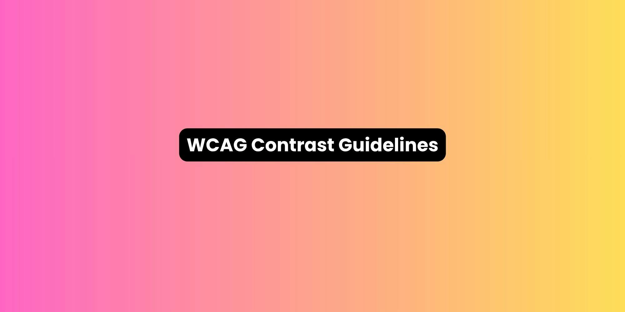
Poor Text Contrast on Gradient Backgrounds

What This Mistake Looks Like

Light text disappears against light gradient areas. Dark text becomes invisible where gradients darken. Content placed directly on complex gradients without consideration for contrast creates readability disasters across the transition.

Why It Hurts UX

Accessibility standards exist for good reasons. WCAG requires minimum contrast ratios between text and backgrounds. 

Mobile users struggle even more; smaller screens and varied lighting conditions amplify contrast problems. Frustrated users skip content they can't read comfortably.

How to Fix It

Apply semi-transparent dark overlays (like rgba(0, 0, 0, 0.4)) between gradients and light text. Use light overlays for dark text to create consistent contrast across the entire gradient range.

Choose text colors that maintain adequate contrast against both the lightest and darkest points of your gradient. Test with contrast checkers to verify compliance.

Consider gradient direction relative to text placement. Position the darkest gradient area behind light text and vice versa.

.hero {
  background: linear-gradient(135deg, #667eea 0%, #764ba2 100%);
  position: relative;
}

.hero::before {
  content: '';
  position: absolute;
  inset: 0;
  background: rgba(0, 0, 0, 0.3);
}

.hero-text {
  position: relative;
  color: #ffffff;
}

This approach layers an overlay between the gradient and text, ensuring consistent readability.

Using Gradients Without Considering Direction or Angle

What This Mistake Looks Like

Random gradient angles create visual confusion. A vertical gradient applied to a horizontal navigation bar fights the natural flow. Gradients running counter to layout patterns make interfaces feel misaligned even when technically centered and balanced.

Why It Feels Off

Visual hierarchy depends on directional cues. When gradients don't align with reading patterns or UI flow, they create subtle dissonance. 

Users might not consciously identify the problem, but they'll sense something feels wrong. Gradient direction should guide the eye toward important elements, not randomly across the screen.

How to Fix It

Align gradients with natural reading direction like left to right for Western audiences. Use diagonal gradients (45° or 135°) to create dynamic movement without fighting horizontal or vertical UI patterns.

Direct gradients toward focal points. A gradient flowing from left to right naturally draws attention to elements on the right side, which is perfect for call-to-action buttons or key content.

/* Random angle fighting layout */
background: linear-gradient(73deg, #667eea, #764ba2);

/* Intentional direction supporting layout */
background: linear-gradient(to right, #667eea, #764ba2);

/* Dynamic angle that still feels natural */
background: linear-gradient(135deg, #667eea, #764ba2);

Test multiple angles in your design tool before committing. Small adjustments create surprisingly different visual effects.

Applying Gradients Everywhere

What This Mistake Looks Like

Buttons use gradients. Cards use gradients. Navigation bars use gradients. Background sections use gradients. Hero images have gradient overlays. The cumulative effect creates visual chaos rather than polish.

Why It Feels Amateur

Overuse eliminates hierarchy. When everything uses gradients, nothing stands out. The design feels busy and dated. Excessive gradients make brand consistency nearly impossible to maintain as projects scale.

How to Fix It

Use gradients sparingly and strategically. Reserve them for hero sections, primary call-to-action buttons, or specific brand elements. Treat gradients as accents, not defaults.

Establish clear rules: "Gradients appear only in hero backgrounds and primary CTAs" provides consistency. This restraint makes gradient usage feel intentional and premium.

/* Reserve gradients for key elements */
.cta-button {
  background: linear-gradient(135deg, #667eea, #764ba2);
}

/* Keep supporting elements simple */
.secondary-button {
  background: #f0f0f0;
  border: 1px solid #d0d0d0;
}

Professional designs use gradients to highlight, not to fill every surface.

Create CSS Gradients

Design stunning gradient backgrounds with live preview and instant CSS code export.

 Make Gradient

FAQs

Are gradients good for accessibility?

Gradients challenge accessibility because contrast varies across the surface. They're acceptable when properly implemented with overlays and adequate contrast testing across all gradient points.

How many colors should a professional gradient have?

Two to three colors maximum. More colors create visual complexity that rarely serves functional purposes and often reduces professionalism.

Should buttons always use gradients?

No. Use gradients selectively for primary actions or brand emphasis. Most buttons work better with solid colors that maintain consistency and clarity.

What's the best tool for generating gradients?

Coolors, Gradient Hunt, and design tools like Figma offer excellent gradient generators. Choose based on workflow.

Conclusion

CSS gradients elevate designs when applied thoughtfully. The mistakes outlined here like harsh transitions, overuse, and excessive application, transform potential elegance into amateur hour.

Fix gradients by choosing harmonious colors, limiting complexity, ensuring adequate contrast, and exercising restraint. Test your implementations across devices and screen sizes to verify they work universally.

When you use gradients sparingly and intentionally, they enhance rather than distract. Minimalism combined with purpose creates the clean, modern interfaces users expect and appreciate.