Understanding typography hierarchy is essential for web designers to create visually appealing and accessible web pages.
Effective typographic hierarchy transforms overwhelming blocks of text into scannable, organized content that guides users through information effortlessly.
Whether you're designing a landing page, blog, or complex web application, mastering typography hierarchy ensures your content communicates clearly and keeps users engaged.
This guide explores the fundamental principles and practical techniques that will elevate your web design projects through strategic typography choices.
What is Typography Hierarchy?
Typography hierarchy refers to the arrangement of text elements to establish a clear visual organization and guide the reader's attention.
This systematic approach uses variations in font size, font weight, typeface, color, and spacing to signal the relative importance of different text elements.
A well-designed typographic hierarchy creates a visual roadmap that helps users navigate content intuitively, distinguishing between primary headings, secondary information, and supporting details.
By establishing clear relationships between text elements, typography hierarchy enables readers to quickly scan pages, locate relevant information, and understand content structure at a glance.
Effective hierarchy creates contrast without chaos, variety without confusion. When implemented properly, readers instinctively understand which content to read first, which sections relate to each other, and how information flows throughout the page.
This intuitive understanding reduces cognitive load and improves comprehension, making typography hierarchy a cornerstone of user-centered web design.
Importance of Typography in Web Design
Good typography enhances readability and legibility, impacting user experience and overall design.
Typography serves as the primary vehicle for delivering information on the web, making it one of the most critical design decisions you'll make.
Poor typographic choices can render even the most valuable content inaccessible or frustrating to read, while thoughtful typography makes complex information approachable and engaging.
Studies consistently show that users spend more time on pages with clear, comfortable typography and are more likely to return to sites that prioritize readable text.
Beyond functional considerations, typography communicates brand personality and establishes emotional connections with users.
A playful sans serif typeface creates a different impression than a traditional serif font, influencing how users perceive your content's credibility and tone.
Typography also impacts conversion rates—landing pages with strong typographic hierarchy guide users toward calls-to-action more effectively than pages with undifferentiated text.
For web designers, mastering typography means controlling both the aesthetic appeal and functional performance of every project.
Key Elements of Typographic Hierarchy
1. Font Size
Choosing appropriate font sizes for headings, subheadings, and body text is crucial for establishing a visual hierarchy.
Font size creates the most immediate and obvious contrast between text elements, making it the foundation of effective hierarchy.
Body text typically ranges from 16 to 18 pixels for optimal readability on screens, while headings should be significantly larger to create clear distinction.
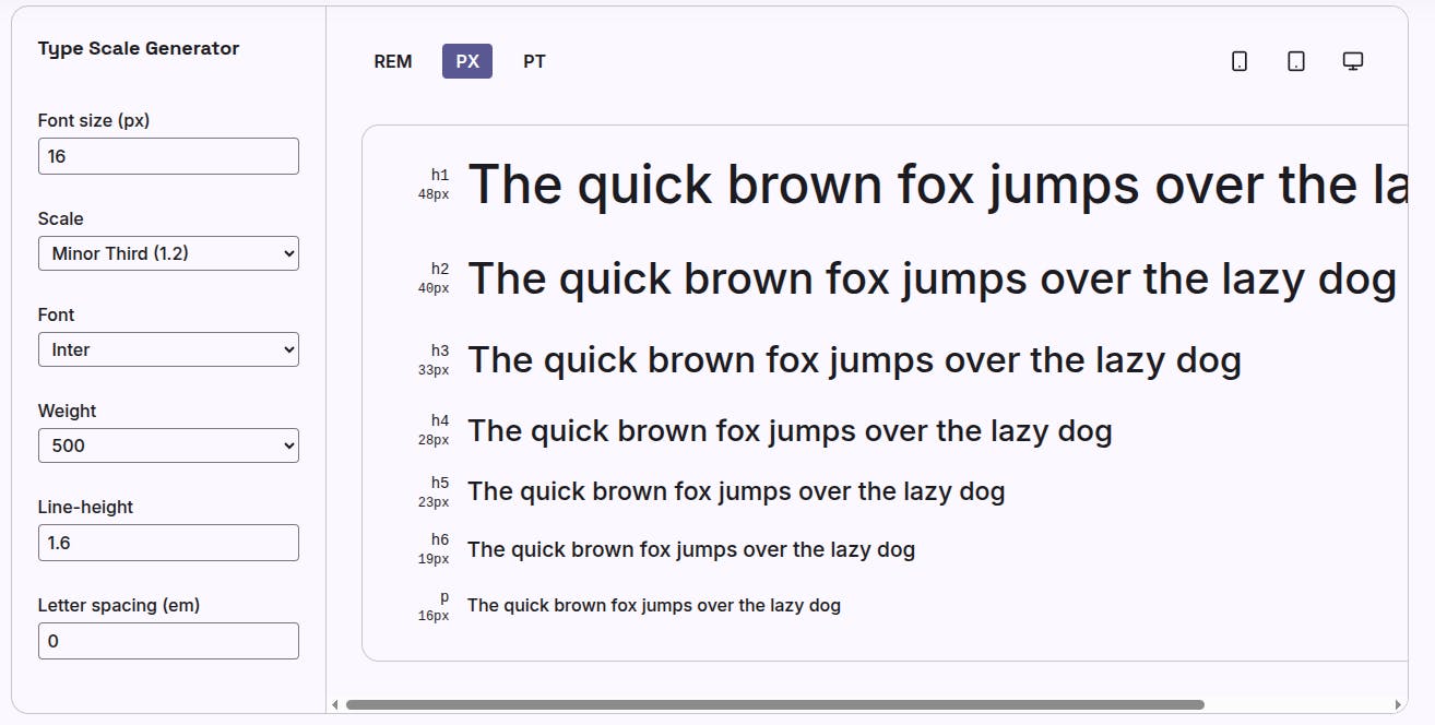
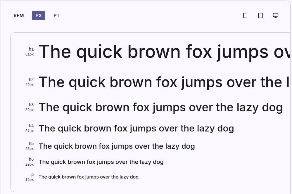
A common approach uses a typographic scale to maintain harmonious proportions between text elements.
When selecting type size, consider viewing distance and context. Mobile devices require relatively larger body text since users hold phones closer than desktop monitors.
Hierarchical relationships should remain consistent across breakpoints, though absolute sizes may adjust for different screen sizes.
Avoid making size differences too subtle. Headings should be noticeably larger than body text to create unmistakable hierarchy.
However, excessively large headings can overwhelm layouts, so balance visual impact with overall page composition.
2. Font Weight
Utilizing different font weights helps to create emphasis and distinguish between text elements.
Font weight ranges from thin (100) to heavy (900), with regular (400) and bold (700) being most common.
Varying weight provides contrast without requiring size changes, making it particularly valuable for subtle hierarchical distinctions.
For example, using a semibold weight for subheadings differentiates them from body text while maintaining similar sizing for better text flow and density control.

Strategic weight variation also creates emphasis within paragraphs—bolding key terms or phrases draws attention to important concepts without disrupting reading flow.
However, overusing bold text diminishes its effectiveness and creates visual noise. Reserve heavier weights for headings, subheadings, labels, and truly important inline text.
Many modern typefaces offer multiple weights, giving designers fine-grained control over hierarchy.
When combining weights, ensure sufficient contrast between levels—pairing regular (400) with light (300) creates minimal distinction, while regular (400) with bold (700) establishes clear hierarchy.
3. Typeface Selection
Selecting the right typeface, whether serif or sans serif, influences the tone and readability of your design.
Serif fonts feature decorative strokes at letter endings, traditionally associated with formality, tradition, and authority.
Sans serif typefaces lack these embellishments, creating cleaner, more modern aesthetics often preferred for digital interfaces.
Your typeface selection should align with content tone and brand identity—legal firms might choose classic serifs while tech startups often favor contemporary sans serif fonts.
Beyond stylistic considerations, typeface selection impacts legibility and readability.
Some typefaces perform better at small sizes, while others excel in large display applications. Variable fonts, which include multiple weights and styles in a single file, offer flexibility while optimizing performance.
When combining different typefaces in a single design, limit yourself to two or three font families maximum.
Typically, designers pair a distinctive display font for headings with a highly readable typeface for body text, ensuring visual interest without sacrificing usability.
4. Line Height and Spacing
Adjusting line height and spacing improves legibility and creates a comfortable reading experience.
Line height, also called leading, refers to the vertical space between lines of text.
Optimal line height for body text typically ranges from 1.4 to 1.6 times the font size—too tight creates cramped, difficult-to-read text blocks, while excessive spacing disconnects lines and disrupts reading flow.
Headings generally require less line height (1.1 to 1.3) since they're rarely multi-line and benefit from tighter, more impactful presentation.
Spacing also includes letter spacing (tracking) and the space between paragraphs and sections.
Slight increases in letter spacing can improve readability for all-caps text or light-weight fonts, while decreased tracking creates density for large display text.
Paragraph spacing provides visual breaks that help readers process information in manageable chunks.
Generous white space around text blocks prevents crowding and gives designs room to breathe. These spacing decisions collectively create rhythm and pacing that guide users through content naturally and comfortably.
5. Color and Contrast
Using color effectively can enhance visual hierarchy and draw attention to important information. Color creates immediate visual distinction—headings in a bold accent color stand out from black body text, while colored links signal interactivity.
However, color should reinforce hierarchy established through size and weight rather than serving as the sole differentiator, ensuring accessibility for users with color vision deficiencies.
Maintain sufficient contrast between text and backgrounds to meet Web Content Accessibility Guidelines, typically requiring a 4.5:1 ratio for body text.
Strategic color use also groups related content and creates visual flow. Consistent coloring for all headings at the same hierarchy level helps users recognize organizational patterns.
You can use our color contrast checker to pick colors that match your brand.
Subtle variations—such as slightly muted text for secondary information—can de-emphasize less important content without removing it entirely.
Designed by macrovector / Freepik
Remember that color carries cultural associations and emotional weight, so choose colors that support your content's message and brand identity while maintaining practical readability across all viewing conditions.
Creating a Typographic Hierarchy
To create a hierarchy, consider the following best practices.
- Start by identifying your content's natural structure such as main headings, subheadings, body text, captions, and other text types.
- Assign each type a specific combination of size, weight, and style that clearly distinguishes it from other levels.
- Use headings and subheadings to break up content into scannable sections that preview what each portion discusses. This chunking makes information more digestible and helps users locate specific topics quickly.
- Establish a typographic scale to maintain consistency across your design.
- Mathematical scales (such as the golden ratio at 1.618 or a simple 1.5 multiplier) create harmonious size relationships that feel balanced and professional.
- This systematic approach ensures consistency while simplifying decision-making—instead of arbitrarily choosing sizes, you follow your established scale.
- Combine different font families thoughtfully, ensuring they complement rather than compete with each other.
- Test pairings to verify they create clear hierarchy and maintain readability at all sizes.
- Avoid cluttering blocks of text by ensuring ample white space between sections.
- Dense text walls intimidate readers and obscure hierarchical relationships. Generous spacing gives each text element room to establish its position in the hierarchy clearly.
- Consider how text elements interact with surrounding design elements like images, buttons, and navigation.
Your typography hierarchy should integrate seamlessly with the overall layout, creating a cohesive visual system that guides users through the entire page.
Best Practices for Typography in Web Design
Implementing best practices ensures that typography supports the overall design and enhances user experience.
Consistency across your site builds user familiarity and reinforces your brand identity.
Develop a typography style guide that documents your font choices, sizes, weights, colors, and spacing rules, then apply these standards throughout your project.
This consistency reduces cognitive load as users learn to recognize and navigate your typographic patterns intuitively.
1. Maintain a Clear Hierarchy
A clear hierarchy guides readers through the content, helping them focus on main points.
Users should immediately identify the most important information on any page through prominent headings and strategic emphasis.
Each level of your hierarchy should be visually distinct from adjacent levels—if users cannot quickly distinguish between heading levels, your hierarchy needs refinement.
Test your designs by viewing them quickly or from a distance; hierarchical relationships should remain obvious even without reading specific words.
2. Optimize for Readability
Consider legibility and readability when selecting type size and style.
Legibility refers to how easily individual characters can be distinguished, while readability concerns how comfortably entire blocks of text can be read.
Choose highly legible typefaces for body text, avoiding decorative fonts that work well for headlines but falter in paragraphs.
Ensure sufficient font size—16px minimum for body text—and comfortable line height. Test your typography with real content at realistic lengths to identify any readability issues before launch.
3. Follow Web Content Accessibility Guidelines
Adhering to accessibility guidelines ensures that all users can engage with your content effectively.
Beyond color contrast requirements, consider users with dyslexia, who benefit from increased letter spacing and sans serif typefaces.
Ensure text can be resized up to 200% without breaking layouts or requiring horizontal scrolling.
Use semantic HTML heading tags (h1, h2, h3) to create meaningful document structure for screen readers.
Avoid using text images when actual text would suffice, as images cannot be resized or read by assistive technologies.
These considerations make your typography accessible to the widest possible audience while generally improving usability for everyone.
Conclusion
Typography hierarchy is a fundamental aspect of web design that impacts usability and aesthetic appeal.
By strategically combining font size, weight, typeface, spacing, and color, you create clear visual organization that guides users through content effortlessly.
Strong typography hierarchy improves readability, enhances user experience, and supports effective communication.
As you develop your typography skills, remember that hierarchy serves your content and users—every design decision should make information more accessible and engaging for your audience.
FAQ
What is typographic hierarchy?
Typographic hierarchy is the arrangement of text elements to create a visual organization that guides the reader through content by establishing relative importance using size, weight, color, and spacing variations.
How do I create a typographic hierarchy?
Establish a clear hierarchy by using varying font sizes, weights, and styles to differentiate between headings, subheadings, and body text. Use a typographic scale for consistent sizing and ensure sufficient contrast between hierarchy levels.
Why is typography important in web design?
Typography plays a crucial role in readability, legibility, and user experience, influencing how content is perceived and understood. Good typography makes information accessible, supports brand identity, and improves overall design effectiveness.
What are the best practices for web typography?
Best practices include maintaining a clear hierarchy, optimizing for readability with appropriate font sizes and spacing, following accessibility guidelines, using consistent typographic scales, and limiting font families to two or three maximum.
Can I combine different typefaces?
Yes, combining different typefaces can enhance visual interest, but it should be done thoughtfully to maintain coherence. Typically, pair a distinctive display font for headings with a readable typeface for body text, ensuring they complement rather than clash.