Responsive Design vs Adaptive Design — Complete Guide Introduction

The difference between responsive and adaptive directly impacts your development timeline, maintenance costs, and user experience.

Responsive Design vs Adaptive Design Poster
Table of Contents

You're building a website, and suddenly you're stuck deciding between responsive design vs adaptive design. Pick the wrong approach, and you'll waste weeks rebuilding layouts, debugging breakpoints, or watching users bounce because your site loads too slowly on mobile.

The difference between responsive and adaptive directly impacts your development timeline, maintenance costs, and user experience. 

This guide breaks down both design strategies, shows you the pros and cons of each, and gives you a clear decision framework so you can choose the right strategy for your project.

By applying proper design thinking, you can ensure your website design meets modern standards.

Responsive Design vs Adaptive Design

FeatureResponsive DesignAdaptive Design
Layout StrategyResponsive design uses a single flexible layout that scales continuously, whereas responsive design flows like water.Adaptive design relies on several fixed layouts where the design layout snaps to predetermined sizes.
PerformanceA responsive site depends on optimization.Adaptive design provides faster load times when implemented correctly because you're serving device-specific assets.
Maintenance Creating a responsive design is faster initially, but may require constant maintenance.Adaptive design requires building and maintaining multiple templates.
Design ControlResponsive design gives less granular control at specific breakpoints.Adaptive design allows for different design elements per device.
SEOA responsive website is SEO-optimized by designAdaptive design can be SEO-friendly but requires extra work

What Is Responsive Design?

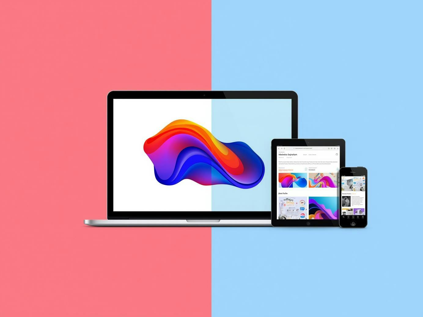
Responsive web design uses a single flexible layout that adapts fluidly to any screen size.

Instead of creating separate designs for desktop, tablet, and mobile, responsive design relies on CSS media queries, flexible grids, and scalable images to automatically adjust your content based on the viewer's device.

A responsive design adjusts the design layout in real-time. Your fluid grid expands and contracts as the viewport changes. 

Images scale proportionally using max-width: 100% so they never break your layout. CSS media queries detect screen width and apply different styles at specific breakpoints. 

Most developers use a mobile-first responsive design approach, writing base styles for small screens and adding complexity as viewports grow. 

The core advantage of responsive design is that the responsive design uses a single codebase to reach everyone.

When to Use Responsive Design

Use responsive design when you need broad device compatibility without managing multiple templates. 

Content-focused sites like blogs, news publications, and documentation benefit most because responsive layouts prioritize readability across all screen sizes.

Responsive design offers faster development and easier maintenance. You're updating one set of files instead of juggling separate mobile design and desktop design versions. 

If your priority is SEO and you want search engines to easily crawl and index your content, you should use responsive web design. 

One URL, one HTML structure, consistent content across devices—that's what Google prefers for a responsive website.

What Is Adaptive Design?

Adaptive web design creates multiple fixed layouts for specific screen sizes. 

Instead of one flexible design that morphs, adaptive design detects the user's device and serves a pre-built template optimized for that exact viewport. 

Adaptive design relies on having distinct assets ready for delivery.

Adaptive web design requires server-side (checking user-agent strings) or client-side (using JavaScript to detect viewport width) device detection. 

Responsive Design vs Adaptive Design poster

Essentially, adaptive design requires building several distinct versions of a site and showing the right one based on the device. 

Each adaptive layout uses fixed widths tailored to common breakpoints: maybe 320px for phones, 768px for tablets, and 1024px for desktops.

When to Use Adaptive Design

The adaptive design approach makes sense when you need highly customized experiences for different devices. 

Complex web applications with divergent UI design requirements benefit from using adaptive techniques.

E-commerce platforms design often use adaptive techniques for conversion optimization.

When you can serve device-specific product grids, checkout flows, and images, you gain precise control over the design and user journey at each breakpoint. 

This focused interface design ensures that the user experience is tailored to the hardware.

Pros and Cons: Responsive Design vs Adaptive Design

Responsive Design: Pros 

  • A single codebase simplifies everything for the responsive and adaptive design workflow. 
  • Responsive design offers better long-term scalability. 
  • The advantage of responsive design is a consistent user experience across devices. 

Responsive Design: Cons 

  • Design doesn't always scale perfectly; complex layouts can be harder to implement.
  • Potentially larger downloads if the design technique doesn't include image optimization. 

Adaptive Design: Pros

  • Highly tailored UX design and optimized performance.
  • Adaptive design may result in higher conversion rates.

Adaptive Design: Cons

  • Higher adaptive design requires more budget. 
  • Complex testing and the risk of design issues between versions.

Technical Deep Dive

Responsive and adaptive web design both rely on CSS, but their design methodology differs.

For responsive, CSS media queries with mobile-first breakpoints are the standard. For adaptive, server-side detection is the primary design technique.

Responsive design and adaptive techniques can overlap, but unlike responsive design, adaptive does not necessarily need a fluid grid.

Responsive Design vs Adaptive Design

Hybrid Approaches

Most modern sites use responsive and adaptive design approaches together. Amazon’s adaptive approach is a famous example; they use responsive layouts for most content but serve device-specific product grids.

This adaptive and responsive design hybrid balances efficiency with optimization. Integrating responsive design and adaptive design elements allows for an effective design that scales.

Implementation Steps

Responsive Roadmap: Design mobile-first wireframes. Create your fluid grid using Flexbox. Test your responsive site across real devices so users can see the design clearly.

Adaptive Roadmap: Define target device groups. Create templates for each breakpoint. Implement detection logic to ensure the adaptive design detects the device correctly.

Tools and Resources

Frameworks like Bootstrap help with responsive web design, while server-side tools assist with adaptive design. Using a responsive checker ensures your responsive vs adaptive web design choice looks great on all screens.

Responsive Design vs Adaptive Design: Which to Choose?

Choose Responsive Design for content sites and blogs. This design offers the best ROI for most businesses. 

Consider Adaptive Design for complex apps where ui design must change significantly between mobile and desktop.

No matter what design you choose, the design aim should always be a good design that serves the user. 

The difference between responsive design and adaptive often comes down to budget. If you are stuck, remember that responsive or adaptive is not always a binary choice; you can start responsive and add adaptive features later.

FAQs

Which is better for SEO?

Responsive design is the standard, but adaptive design works if handled correctly.

Can a site be both?

Yes, responsive and adaptive design hybrids are very common.

Is it easier to design responsive?

For simple sites, yes. For complex apps, adaptive or responsive both have challenges.

Summary

The difference between responsive and adaptive is fundamental to your design and layout strategy. Whether you choose responsive vs adaptive design, prioritize the user experience.

Use responsive design for broad reach and adaptive design for precision. No matter the design requires, ensure your app design is functional and fast.